CHROMA KEY NOTES / 003
Uneven Green Screen Lighting: Diagnose It Before You Key
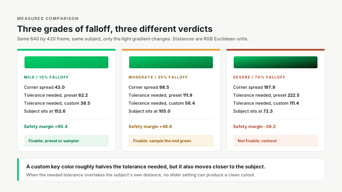
Uneven lighting is not a slider problem; it is a capture problem that you can measure in under a minute. Use the eyedropper on four corners of the backdrop and compare the hex values: if they are close, one key color plus a modest tolerance will clean the frame, and if the spread is wide, a custom key color may help but a badly lit shot must be relit and reshot. On our own 640 by 420 test frames a 15 percent falloff leaves a corner spread of 43.0 RGB units and a comfortable safety margin of 90.4, while a 70 percent falloff produces a spread of 197.9 and a negative margin of 39.2, meaning no tolerance setting can clear the backdrop without also deleting the subject.
Open the green screen remover ↗
One light turns one screen into many greens
A color key is a distance test. It takes one chosen key color, measures how far every pixel sits from it in color space, and makes a pixel transparent when that distance falls under the tolerance threshold. That is the whole mechanism. It has no concept of a backdrop as a physical surface, so it cannot know that a dark green patch in the corner and a bright green patch beside the lamp are the same cloth. To the algorithm they are simply two different colors, and only one of them can be the center of the test.
Lighting is what decides how many colors the cloth records as. A screen lit evenly from both sides reflects roughly the same spectral distribution across its whole area, so the camera writes one green. Light it from one side and the illuminance falls off continuously with distance; add a vertical crease and a fold throws its own shadow; let the camera auto-expose and the recorded green drifts again. The result is a smooth gradient plus discrete darker bands, not a solid color. That is why the failure looks so peculiar: a clean edge on the bright side, stubborn green speckle or a solid green wedge on the dark side, and no single slider position that fixes both at once.
This is also why the usual advice to "just increase tolerance" is incomplete. Widening the radius does eventually reach the darker green, but it reaches everything else at that radius too, including dark clothing and shadowed parts of the subject. The useful question is not "how high should tolerance go" but "how much room do I have between the farthest backdrop color and the nearest subject color". That room is a measurable quantity, and it is the whole basis of the four-corner test below.
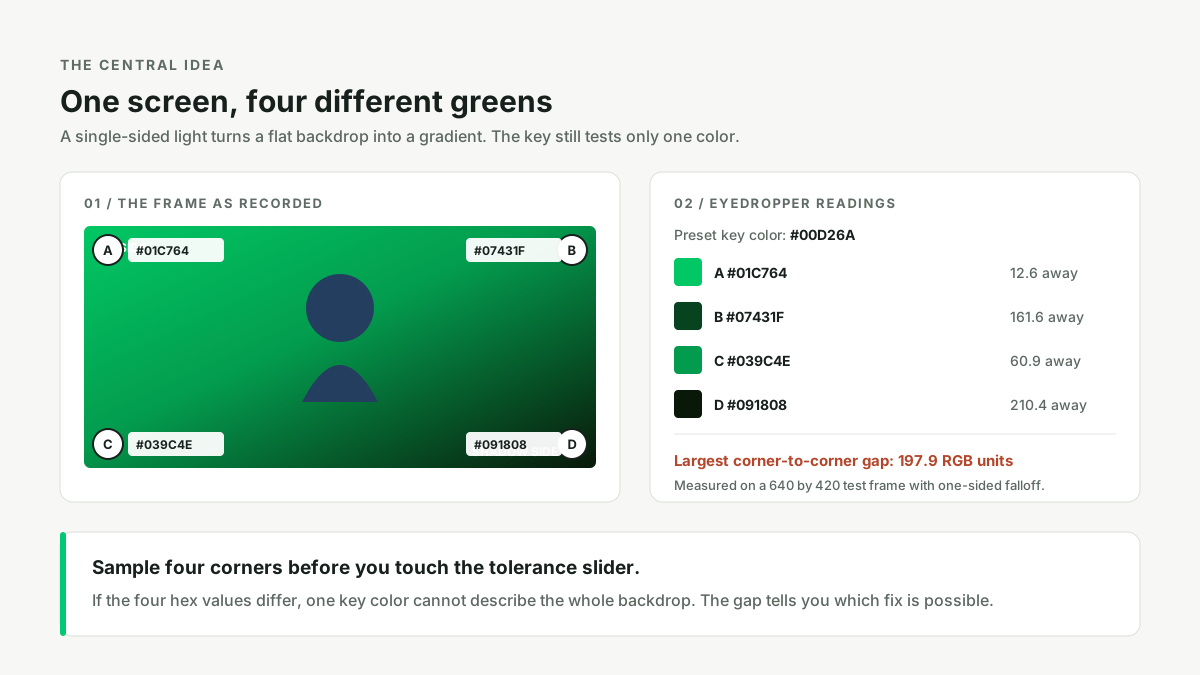
The four-corner test, measured on three frames
To put a number on this, we built three test frames from the sample image that ships with this tool. The source is a 640 by 420 RGB PNG with a perfectly flat backdrop of #00D26A, a dark fabric subject of #243E60 and a skin tone of #EEB584. We decoded it with a small pure-Python PNG reader (zlib plus the five PNG row filters) rather than an image library, then generated three variants that apply a one-sided brightness falloff of 15, 35 and 70 percent from left to right, a smaller vertical falloff, a narrow crease shadow across one band, and a slight white-balance drift on the shadow side. Nothing here is a photograph of a real set: it is a controlled, reproducible model of what a badly lit set does to a flat backdrop, and the numbers below are actual pixel readings from those generated PNGs, not estimates.
For each frame we sampled the four corners near (32,32), (607,32), (32,387) and (607,387), plus the centre and the crease band. We then computed two key colors: the tool's preset green #00D26A, and a custom key equal to the average of the four corner readings. For every pixel of the backdrop we computed Euclidean distance in RGB to each key; the largest of those distances is the tolerance you would need to clear the backdrop completely. Separately we computed the distance from the subject's dark fabric to the same key. The difference between the two is the safety margin: positive means a tolerance exists that removes the backdrop and keeps the subject, negative means no such tolerance exists.
| Frame | Four corners (hex) | Corner spread | Tolerance needed, preset / custom | Subject distance, preset / custom | Safety margin, custom |
|---|---|---|---|---|---|
| Flat baseline | All four #00D26A | 0.0 | 0.0 / 0.0 | 152.6 / 152.6 | +152.6 |
| Mild, 15% falloff | #00D069, #01B35A, #01C664, #02AA55 | 43.0 | 62.2 / 38.5 | 152.6 / 131.7 | +93.2 |
| Moderate, 35% | #00CC67, #038A44, #01B75C, #047539 | 98.5 | 111.9 / 56.4 | 152.6 / 105.0 | +48.6 |
| Severe, 70% | #01C764, #07431F, #039C4E, #091808 | 197.9 | 222.5 / 111.4 | 152.6 / 72.3 | -39.2 |
The baseline row is the control. On the flat sample all four corners read exactly #00D26A and the spread is zero, so a tolerance barely above zero clears the whole backdrop with 152.6 units of room before the subject is touched. This is what a correctly lit screen looks like in numbers, and it is the state you are trying to get back to.
The other three rows show the gradient eating that room. At 15 percent falloff the darkest corner is 45.2 units from the preset, the crease band reaches 55.0, and the worst pixel anywhere on the backdrop is 62.2. Since the subject sits at 152.6, there is still 90 units of slack. At 35 percent the worst backdrop pixel is 111.9 from the preset while the subject remains at 152.6, leaving only 40.7. At 70 percent the worst backdrop pixel is 222.5 from the preset, which is already 69.9 units beyond the subject's dark fabric: clearing the backdrop with the preset would delete the subject first.
What the eyedropper actually buys you
The custom key is the average of the four corner samples, which on the severe frame comes out as #057036 against the preset #00D26A. Recentering on that darker green cuts the required tolerance almost exactly in half on every frame: 62.2 becomes 38.5, 111.9 becomes 56.4, and 222.5 becomes 111.4. This is the real and limited benefit of the sampler, and it is why using it is worth the ten seconds it costs even when you intend to keep the preset.
There is a catch that is easy to miss and that the table makes explicit. Moving the key color toward the dark green also moves it toward dark foreground colors. The subject's dark fabric is 152.6 units from the preset but only 131.7 from the mild custom key, 105.0 from the moderate one and 72.3 from the severe one. So the custom key shrinks both sides of the comparison at once: the tolerance you need goes down, but the budget you have goes down too. On the mild and moderate frames the net margin improves slightly, from 90.4 to 93.2 and from 40.7 to 48.6. On the severe frame it stays negative, going from -69.8 to -39.2. A better key color cannot manufacture separation that the lighting never recorded.
This also explains a specific and very common observation from editors: two key colors do not add up. Someone working with a shadow across the screen in ffmpeg wrote that "Increasing the tolerance got side effects" and, after trying two colorkey passes with 0x32AB57 and 0x016733, "it either removes the shadowed area or the light area" (Video Stack Exchange 34478). That is not a bug in the filter. Each pass is a radius around its own center; a wide radius that clears the dark region also covers the subject, and a narrow radius that preserves the subject leaves the dark region. There is no threshold between them on a severe gradient, which is exactly what the negative margin predicts.
What people actually run into
The measured pattern above matches the failure reports people post when they try to key real footage. A short-film crew with a breaking glass object in front of the screen wrote that "Unfortunately the green screen was uneven causing different shadings on the background" and that their editor would have to rotoscope the frames (Video Stack Exchange 21571). A recurring studio shoot described the physical cause precisely: "When the talent is on the taller side, their feet hang down past the bottom of the exam table and create really harsh shadows on the green screen, making the footage very difficult to key", adding that "Keying is very difficult around the feet shadows" (Video Stack Exchange 14623). In both cases a cast shadow is not a cosmetic blemish; it is a second, much darker green that sits far outside the radius chosen for the lit part of the screen.
The same problem appears at a smaller scale. Someone setting up a home studio asked whether a rough stucco wall painted with chroma paint would work: "will little shadows mess with the chromakey effect and defeat the purpose? In other words, do I need to put some other flat surface in front of these walls?" (Video Stack Exchange 22360). Yes, they will: texture is thousands of micro-gradients, and no tolerance can be narrow enough to protect the subject while also being wide enough to cover the full range of green those gradients produce. A tensioned flat surface costs less than an afternoon of tuning.
Other reports sit at the boundary between lighting and camera settings. A DSLR shooter with a hand-painted canvas noticed that "When the phone's screen is a light color the green darkens" (Video Stack Exchange 20199), which is auto exposure reacting to a changing frame. An editor who had done everything else reasonably well found that "it is not absolutely perfect because of the lighting" and had read that "one should not select one color but a range" (Video Stack Exchange 5040). That instinct is correct, and it is the same conclusion our numbers reach: a range of greens needs a range-aware method, not one color and one threshold.
Beginners tend to look for a software answer first. One person wrote "I didn't think I'd have to light it, and it looks to complicated. As long as there are no shadows, would it be ok to not go through complicated steps to evenly light it and just use it?" (Video Stack Exchange 20771). Another asked "Do I need to light the green screen with 2 softbox lights?" while planning a DIY setup (Video Stack Exchange 17033). The honest answer to both is that the number of lights matters less than the uniformity they produce; two cheap panels placed symmetrically and metered at the corners beat one expensive light blasting from the left. A third user comparing two low-budget setups asked which lamp position relative to the talent was better (Video Stack Exchange 24790), which is the right question to be asking before a shoot rather than after it.
Fixing the frame on set
- Light the screen as its own subject. Give the backdrop two matched sources aimed at it from either side, roughly equidistant, so the left and right halves receive similar illuminance. Meter or eyeball the four corners; the goal is that a test frame produces four nearly identical hex values.
- Keep subject lighting separate. Light the person or product with its own key and fill so the screen is not doing double duty. This also reduces bounce, which is the separate problem described in Green Spill After Keying.
- Increase distance and flatten the surface. Put a metre or more between subject and screen, pull the fabric tight, and steam out creases. Each fold is a self-shadow, and each self-shadow is another green.
- Lock the camera. Manual exposure, manual white balance and a fixed ISO stop the recorded green from drifting between frames. Auto modes are a common reason a preset works on one shot and fails on the next.
- Take a test frame with no subject. A photograph of the empty screen makes the gradient obvious. Sample its four corners and write down the spread before you commit to a full shoot.
None of these steps require new software. They change the input so that a single color key is an appropriate tool for it. The broader set of failure modes, including hair, glass, tracking markers and accidental holes, is catalogued in Why a Green Screen Remover Fails; uneven lighting is the one that is cheapest to prevent and most expensive to repair.
When to stop tuning and reshoot
Be explicit about the boundary, because it saves more time than any preset. This tool runs locally in the browser with the Canvas API and offers a key color with an eyedropper, a tolerance and an edge-softness control. It has no way to model a lighting gradient, no local adaptive threshold, no despill pass and no subject segmentation. It cannot treat the top-left corner differently from the bottom-right corner, because the operation is one global distance test applied uniformly to every pixel.
So the decision rule is arithmetic. Sample four corners, compute the largest pairwise difference, and use the average as a custom key if the spread is moderate. If the tolerance needed to clear the darkest region is greater than the distance from the key color to the darkest part of your subject, there is no valid setting: stop, relight, reshoot. On our severe frame that condition is met with 39.2 units to spare on the wrong side. Edge softness will not help, because it feathers an existing alpha boundary; it cannot create separation between two colors that lie inside the same radius. If reshoooting is impossible, use a segmentation tool or manual masking, which classify by shape rather than by color.
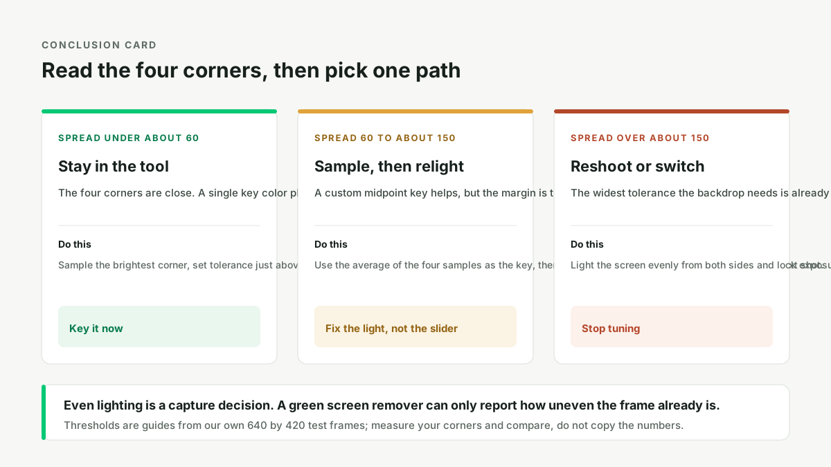
A five-minute diagnostic routine
- Open the image and sample four corners. Use the eyedropper on a clean backdrop pixel near each corner, plus one in the centre. Write down all five hex values.
- Compute the spread. Take the largest difference between any two of the four corner readings, in RGB distance. If your editor shows only hex, a rough mental shortcut is to compare the green channel: a difference of 20 levels in G is mild, 60 is moderate, 100 or more is severe.
- Decide by spread, not by eye. Under about 60: keep the preset or sample the brightest corner and use a small tolerance. Between about 60 and 150: sample the average of the four corners as a custom key, expect some speckle in the dark corner, and fix the light before the next shot. Over about 150: relight and reshoot, or move to segmentation.
- Watch the subject's darkest area while raising tolerance. Stop at the first sign that shadowed fabric, hair or a dark edge begins to thin. That stopping point is your real ceiling, and on a severe gradient it arrives before the backdrop clears.
- Verify on a checkerboard. Export the PNG and view it over a checkerboard and over dark grey. Residual green patches on the dark side of the frame are the gradient, not leftover alpha, and no amount of feathering will remove them.
One last point about reading these numbers. Our three test frames are deliberately controlled: a linear falloff, one crease and a slight color drift. A real set adds bounce, fabric texture, mixed color temperatures and compression, all of which widen the spread further. Treat the 60 and 150 thresholds as order-of-magnitude guides from a reproducible measurement, not as constants. The method is the transferable part: four samples, one spread, one comparison against the subject's own distance from the key. Measure your frame, then decide.
Questions people actually ask
- How do I tell if my green screen is evenly lit?
- Sample four corners with the eyedropper and compare the hex values. On our flat test frame all four read #00D26A, a spread of zero; on the severe frame they span 197.9 RGB units. A spread under about 60 is keyable, over about 150 needs a reshoot.
- Will a custom key color fix uneven green screen lighting?
- It helps up to a point, but it cannot rescue a badly lit frame. Averaging the four corners halves the required tolerance, from 222.5 to 111.4 on our severe frame, yet it also pulls the key closer to the subject, leaving the safety margin at -39.2.
- Why does raising tolerance remove either the shadowed area or the light area, but never both?
- Because one tolerance is one radius around one key color. The lit and shadowed greens sit at different distances from that center, and the subject's dark colors sit inside the wider radius. Two passes do not stack; each is its own distance test.
- Will little shadows from a rough wall mess with the chroma key effect?
- Yes. Texture creates thousands of tiny brightness gradients, and each one is a different green to a per-pixel color test. Put a flat, tensioned surface in front of the wall, or use subject segmentation.
- Is lighting a green screen really necessary, or is a shadow-free wall enough?
- Lighting it separately is necessary. Shadow-free is not evenly lit: a wall can have no cast shadow and still show a smooth gradient that reads as several greens. Use two matched sources on the screen, separate subject lighting, and manual exposure.
- Should I use two key colors for the light and dark halves?
- No, not in a single-pass color key. One global threshold is applied to every pixel, so a second key color replaces the first rather than adding coverage. Splitting the frame with masks in an editor can work, but at that point relighting is faster.